Ava Stucci  /  SVERA

SVERA

Brand identity and guidelines for a body, sound and mind studio in Berlin. Creative direction, logotype, colour, gradient system and applications.
ClientSVERA, Berlin
RoleCreative Direction, Identity
StudioStudio AVA
DeliverablesLogotype, colour, gradient system, stationery, social
Year2024
00Overview

SVERA is a body, sound and mind studio in Berlin. The brief was an identity that could hold those three ideas at once without illustrating any of them.

The answer was to make the identity almost entirely atmospheric. One logotype, set once and never decorated. One typeface. A colour system carried not by flat swatches but by a set of photographed gradients: soft organic masses, out of focus, grain left in. They read as a body, a breath or a sound chamber depending on where you meet them, which is the point. The type stays flat, small and exactly level on top, so the atmosphere never becomes noise.

Delivered as a complete handover: layered source files, print-ready stationery, social templates and this specification.

01Logotype

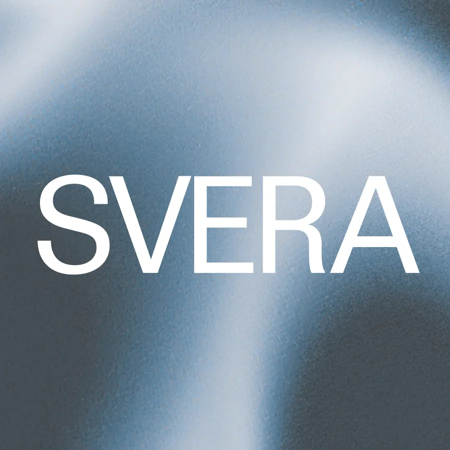
The wordmark is the name set in the brand typeface, unmodified, in caps. There is no symbol, no lockup variant and no stacked version. It is the only permanent element in the system — everything else changes colourway season to season.

Construction
Set in ABC Permanent Book, caps, no manual kerning
Clear space
One cap height on all four sides, minimum
Minimum size
24 mm wide in print · 120 px wide on screen
Proportion
Wordmark width = 3.8 × cap height. Never re-space to fit
Permitted colours
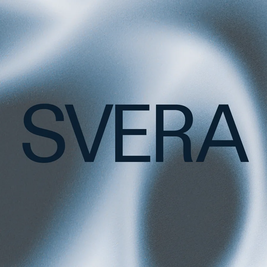
Black · white · the ink tone of the active colourway
Square format
1080 × 1080, wordmark at 85% of canvas width, optically centred
On a post
Top right, one cap height in from the top and right edges
On a photograph
Omitted. The title block carries the name instead

02Typeface

One typeface across the whole identity: ABC Permanent, Book. A neo-grotesque with a narrow set width and flat terminals — it holds its shape at 2 mm on a card and stays quiet on top of a gradient, which is the only job it has here. No second family. No weights above Book except where a single line needs to hold against a dark field.

SVERA
BODY   SOUND   MIND
ABCDEFGHIJKLMNOPQRSTUVWXYZ  0123456789  @ . , &
Note. Specimen shown in a substitute grotesque — the page does not license the retail font. Set artwork in ABC Permanent.
Family
ABC Permanent — Book is the only cut used
Case
All caps, everywhere, including the handle
Tracking
+20/1000 em on all set text
Leading
1.2 × size
Card size
≈8 pt — cap height 1.95 mm measured on the 85 × 55 mm card
Alignment
Flush left, or set on one shared baseline across the width
Never
Italic, bold, condensed, outlined or letter-spaced beyond +20

Production note. The portfolio specimen uses a substitute grotesque. Production artwork should use a licensed copy of ABC Permanent.

03Colour

Three colourways, one structure. Each runs from a deep tone that can carry type, through a mid, to two pale tones that make up most of any surface. The pale end does the work: these are near-white materials with colour pooling in them, not coloured backgrounds. Values below are sampled from the delivered artwork.

Green — primary
Ink / flat#2A4421
Deep#29451F
Mid#7C945E
Soft#B9CAB1
Pale#D3E1CB
Lilac — secondary
Ink#2D1932
Deep#594955
Mid#9F84A5
Soft#D4C7D9
Pale#E6DDED
Blue — secondary
Ink#324850
Deep#454D54
Mid#839DB4
Soft#CAD8E5
Pale#E7EEF7
Paper
#FFFFFF — the shared ground under every colourway
Type on gradient
The ink tone of that colourway, never pure black
Type on flat
Pale tone of the same colourway on the ink flat
Print
Artwork supplied CMYK at 300 ppi. Match to the ink tone first
Mixing
One colourway per surface. Colourways never meet on the same piece
04Gradient system

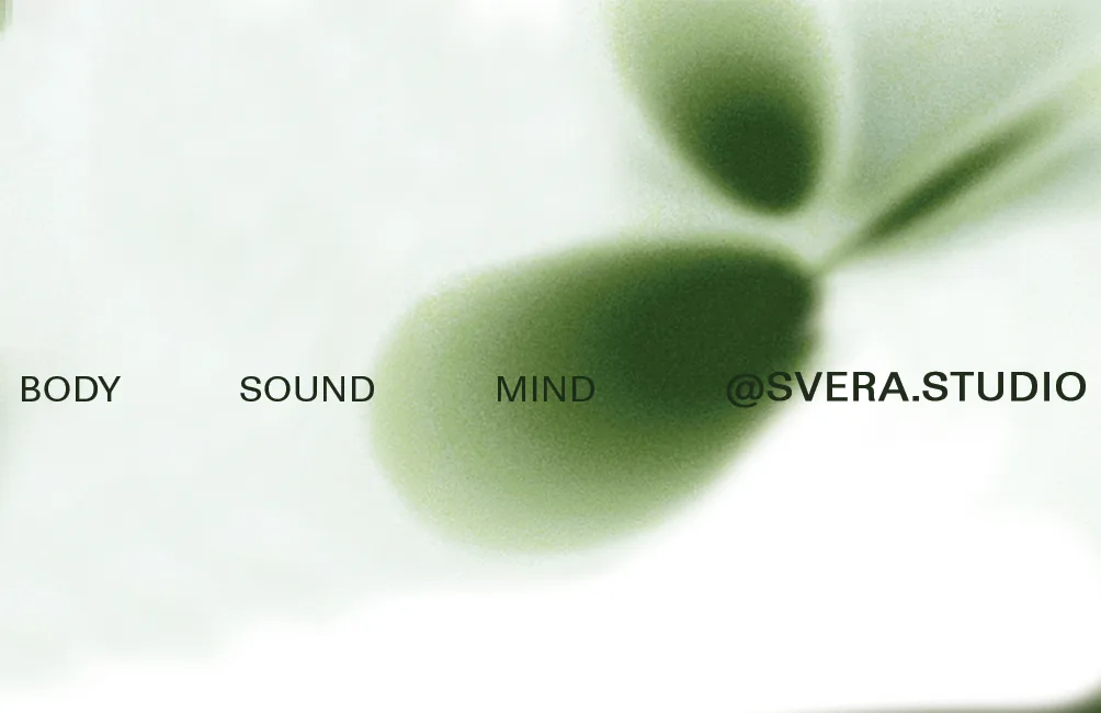
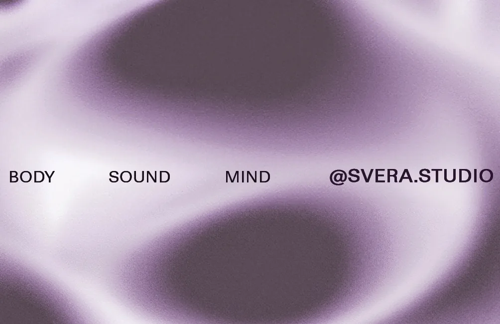
The gradients are the identity. Each is a photographed organic mass thrown far out of focus, bloomed toward white at one edge and holding a dense pool at the other, with film grain kept rather than cleaned off. The grain is load-bearing — it stops the image reading as a digital gradient mesh and keeps it material.

Green gradient plate
Green. Two masses, high-key, white bloom bottom-left.
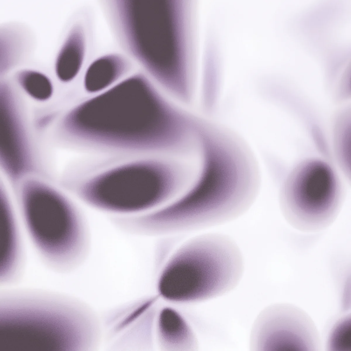
Lilac gradient plate
Lilac. Mirrored masses, deepest tone through the centre.
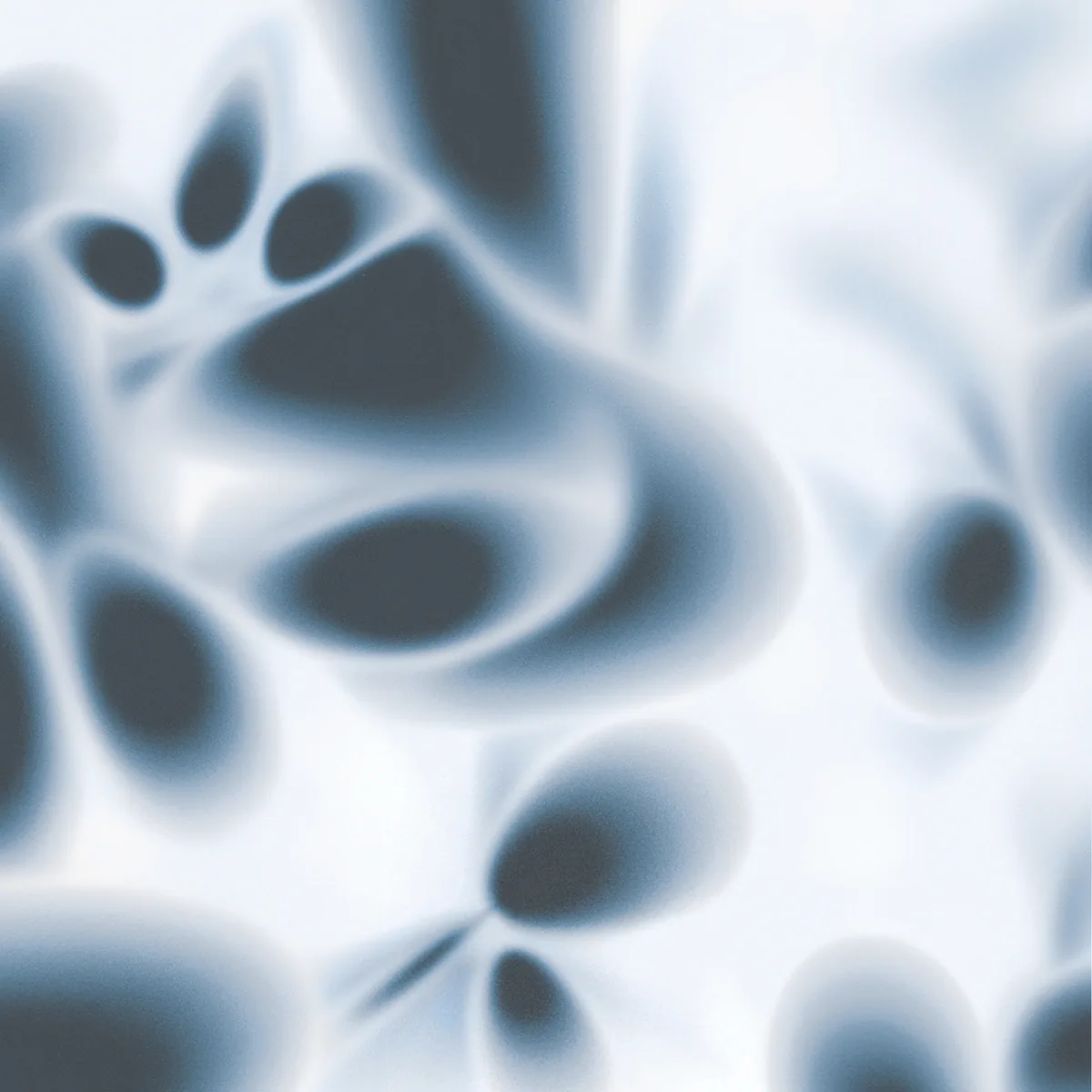
Blue gradient plate
Blue. Sweeping bands, the coolest and most open of the three.
Source
Photographic, defocused. Not a generated mesh or a filter
Grain
Retained. Never denoise, never upscale a plate past 100%
Value range
Must reach near-white at one edge and the ink tone at another
Crop
Free, but keep one clear high-key field for type to sit in
Layering
Nothing sits on a gradient except type. No scrims, no overlays
Masters
202405_Template_Gradient.psd — layered, recolourable
05Photography

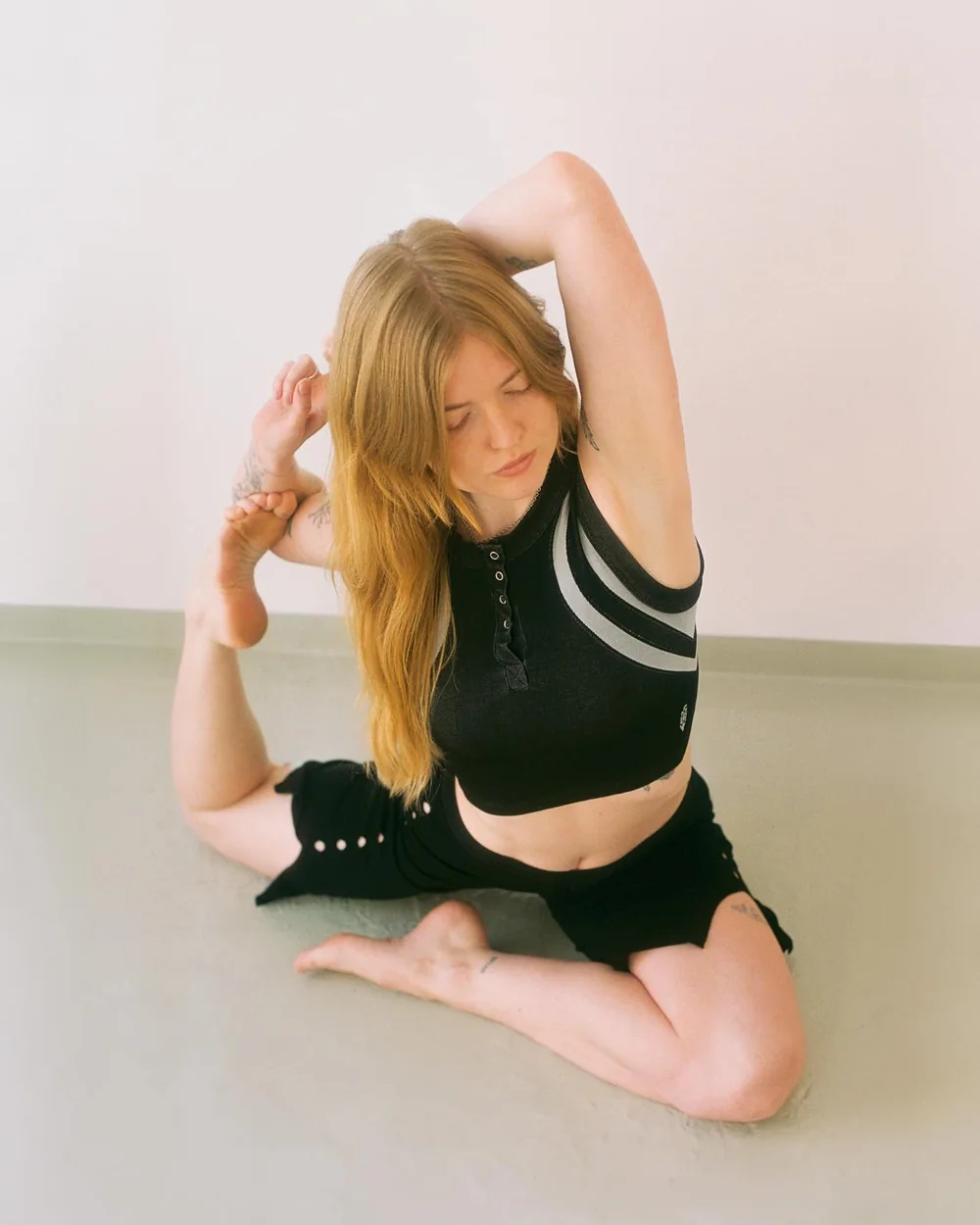
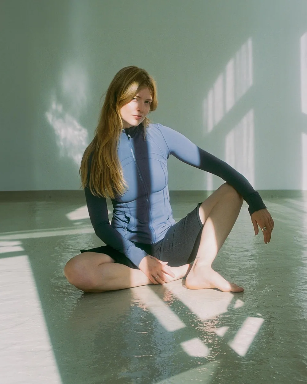
Photography is the gradient system's other half: the same soft masses, only now they are bodies. Shot on film in daylight, in a bare room, with the figure low to the floor and a lot of empty wall above it. That empty wall is where the type goes, so the frame is composed for the type before it is composed for the body.

The grade is the discipline. Colour is pulled almost out — the delivered frames run at 6–12% mean saturation, so skin, concrete and cotton all drift toward the same cool neutral. Highlights are held off pure white and shadows off pure black, which is exactly what the gradients do, and why a photograph and a plate can sit on the same page without arguing.

SVERA studio photography: a figure seated on the floor in a bound pose against a bare wall
Figure low, wall empty. The body reads as one continuous mass, like a plate.
SVERA studio photography: a figure seated in hard window light in a green-washed room
Daylight only. Hard window light is welcome; added light is not.
Stock
Film. Grain visible, matching the gradient plates
Light
Daylight only. Window shapes and floor reflections are kept
Saturation
6–12% mean. Never a saturated garment or prop
Tonal range
Highlights held off white, shadows off black — never clip either end
Framing
Figure in the lower half; the upper half is reserved for type
Wardrobe
Black, grey, slate, olive. The colourways stay in the graphics
Location
The bare studio. No styling, no props, no equipment in frame
06Composition

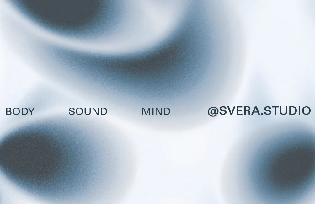
One rule holds the whole system together: all type on a surface sits on a single shared baseline, set small, tracked open, and spread across the full width. The gradient moves; the type does not. On the card that line carries the three-word strapline and the handle at once, which is the entire front of the piece.

SVERA business card front, green colourway, with the shared baseline marked
The baseline, marked. It sits at 56% of the card height — optically centred, not mathematically.
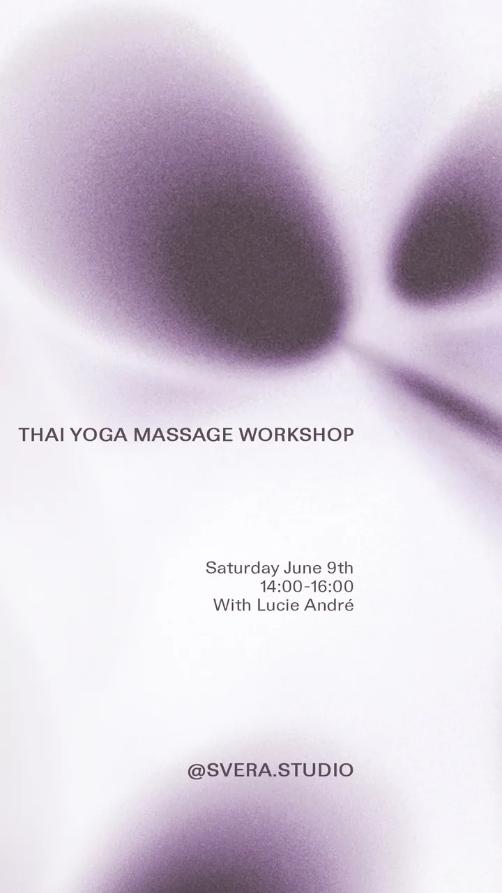
SVERA Instagram story, lilac colourway, workshop announcement
In a tall format the rule repeats: three fixed lines, each one flush and level.
Strapline
BODY  SOUND  MIND — in that order, evenly spread, one line
Handle
@SVERA.STUDIO — always the last item on the line, flush right
Baseline
56% of surface height on the card; optically centred elsewhere
Margin
Type may run close to the trim. The gradient always bleeds
Hierarchy
Three levels maximum: title, detail, handle
Centring
An announcement may centre as one block, title and detail together. The strapline and the handle never do
07Applications

Stationery was delivered print-ready in all three colourways so the studio could run a season in one and switch without a redraw. The reverse drops the gradient entirely for the flat ink tone — the only place in the system where flat colour is allowed to fill a surface.

SVERA business card, lilac colourway
Card front — lilac.
SVERA business card, blue colourway
Card front — blue.
SVERA business card reverse, flat green with address and email
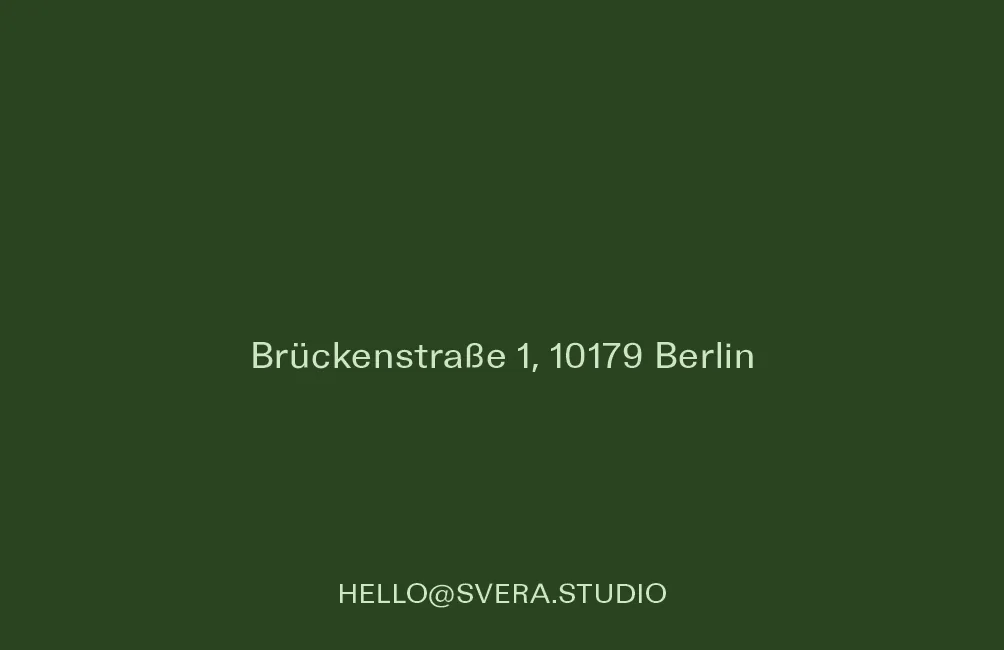
Card reverse — flat #2A4421, address and contact only.
SVERA business card, green colourway
Card front — green, the primary.
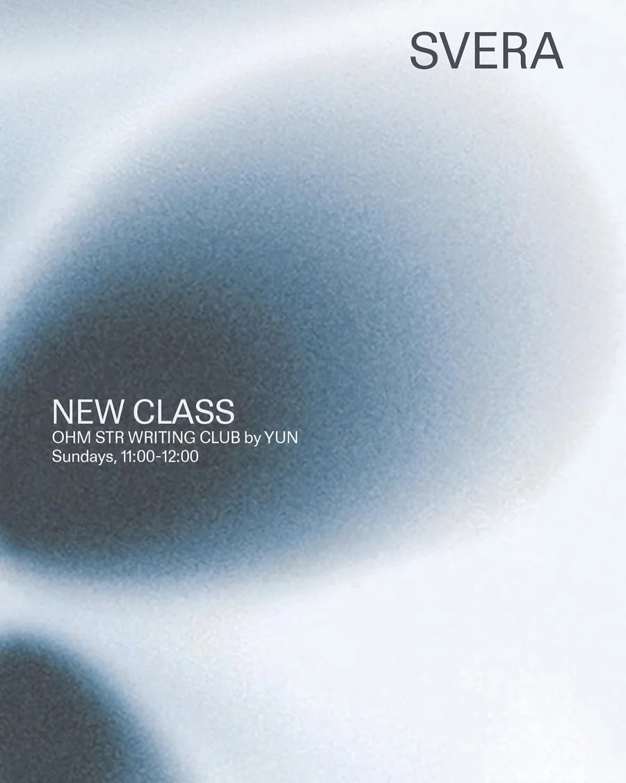
SVERA post, blue colourway: NEW CLASS, OHM STR Writing Club
Post — blue, flush left on the dark mass.
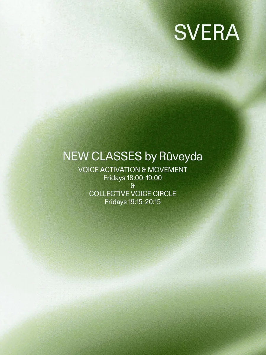
SVERA post, green colourway: new classes by Rûveyda
Post — green, two classes centred as one block.
SVERA Instagram story template, single-line title variant
Story — single-line title.
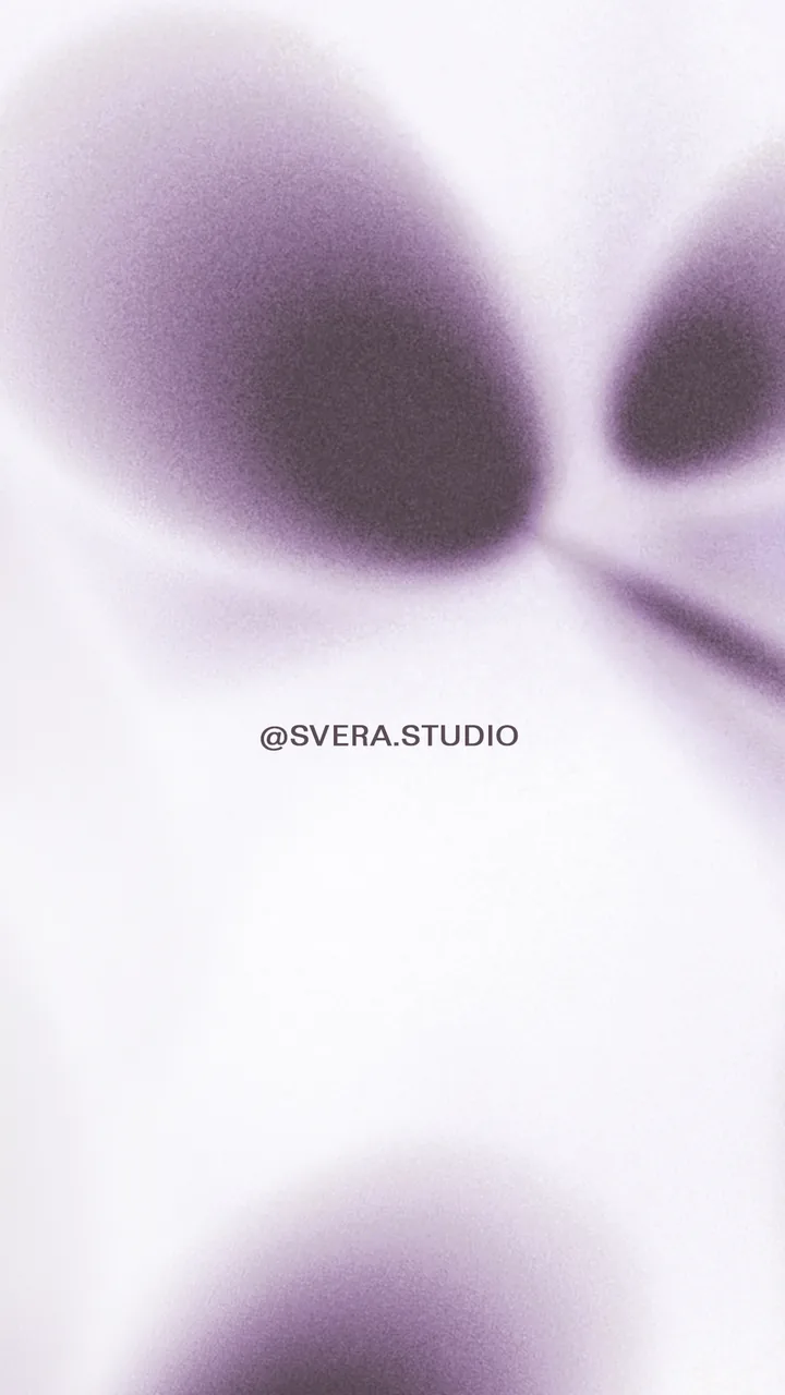
SVERA Instagram story template, handle only
Story — handle only, for stills and reposts.
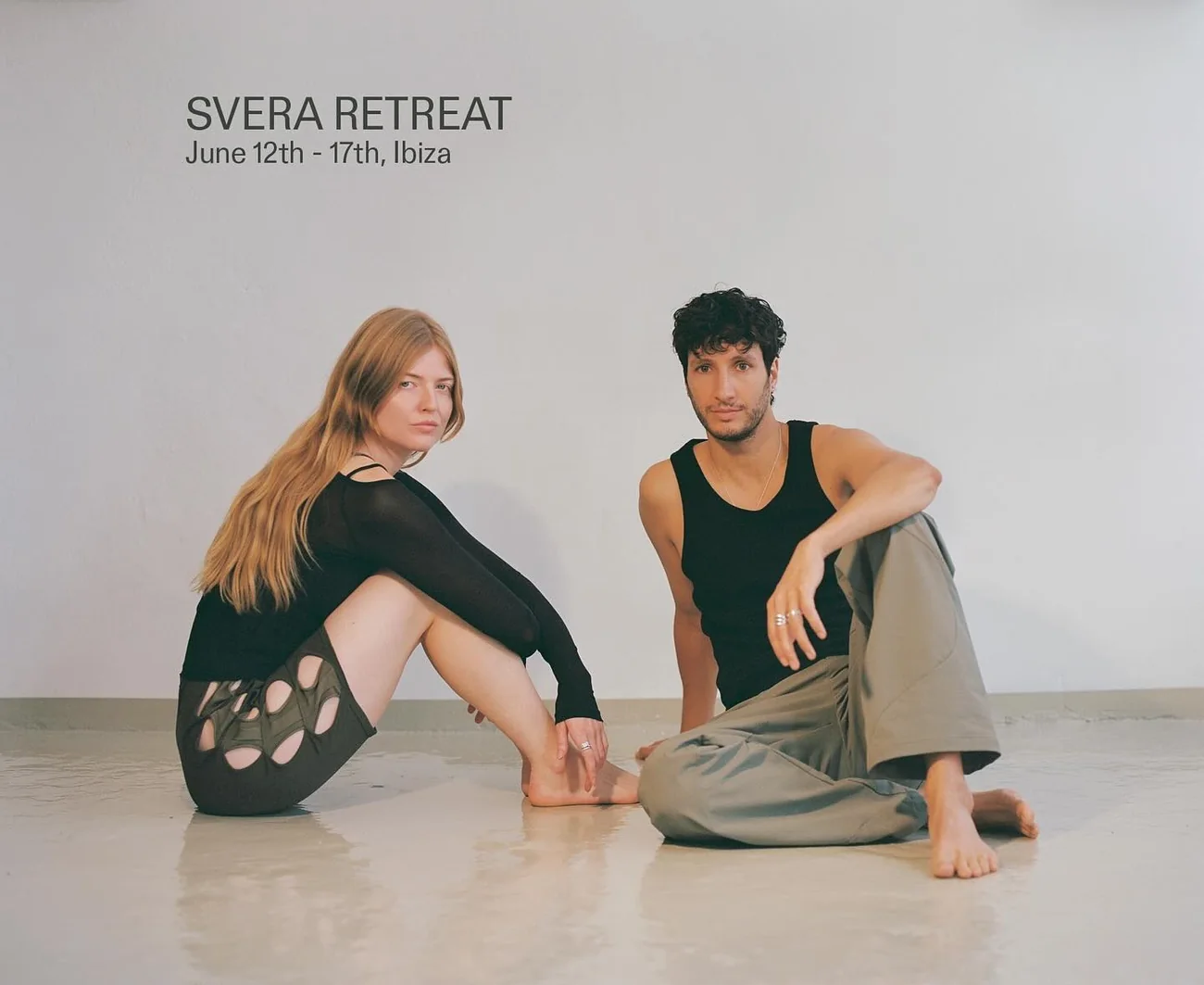
SVERA Retreat campaign image: two figures seated on a studio floor, title set on the bare wall above them
Campaign. Where a photograph carries the type, it sits on the empty wall the frame was composed to leave — flush left, two levels, ink on daylight.
Business card
85 × 55 mm, CMYK, 300 ppi, full bleed, uncoated stock
Card reverse
Flat ink tone, pale type, two lines, no gradient
Story / reel
1080 × 1920, RGB, gradient full bleed
Feed post
1080 × 1350, RGB, wordmark top right at 1 cap from each edge
Campaign
Photograph, type on the empty upper half, never over a body
Editable masters
Layered PSD per format, type live, gradient on its own layer
08Do & don't

Do

  • Let the gradient bleed to every edge
  • Keep type small, level and tracked open
  • Use one colourway per surface and hold it for a season
  • Leave the grain in
  • Set the handle last on the line, flush right
  • Reach near-white somewhere in every gradient crop
  • Compose a photograph for the type first, the body second

Don't

  • Add a symbol, monogram or stacked lockup
  • Put anything but type on a gradient — no scrims, no boxes, no shadows
  • Mix two colourways on one piece
  • Set the wordmark in a second typeface or re-space it
  • Fill a surface with flat colour, except the card reverse
  • Stack the strapline, or break it across lines
  • Set type over a body, or over the busiest part of a plate
09Handover

Delivered 28 May 2024, with a recorded walkthrough of the layered files so the studio could produce new pieces without coming back to me.

FileFormatSize
202405_Template_GradientPSD, layered85 × 55 mm
202405_BusinessCard_SVERA_HandoverPSD, CMYK 300 ppi85 × 55 mm
SVERA_Template_InstagramStoryPSD, RGB1080 × 1920
SVERA_LOGO_SQUAREPSD, RGB1080 × 1080
Wordmark, black & reversedPNG, transparent1080 × 1080
Gradient plates, three colourwaysJPG, hi-resfull bleed
Cards, three colourways + reverseJPG, press proof85 × 55 mm
Walkthrough recordingMP4screen capture